Sometimes, when reviewing comic books, you come into a series a few issues late. It is a rare occasion that issue #6 of a series makes you want to go back and read 1-5. Family Tree made me want to buy the trade paperback.
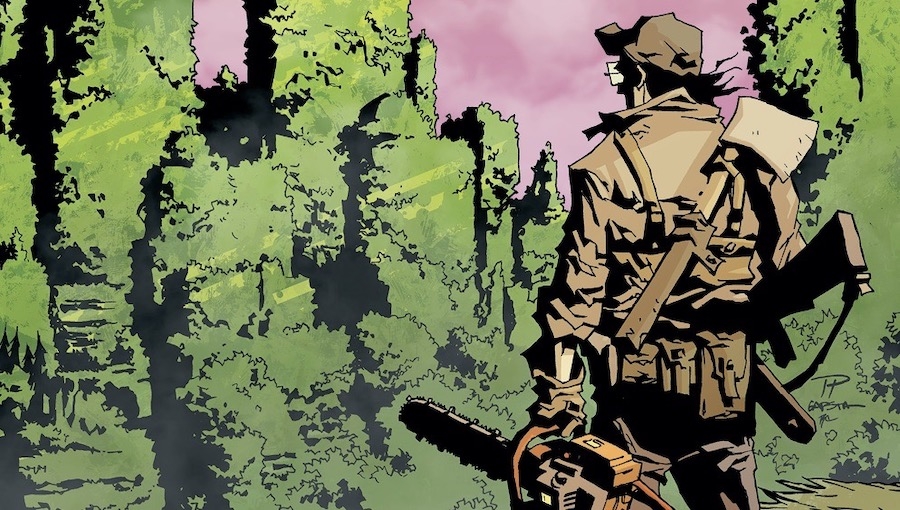
This all starts with the very Lovecraftian cover. The lettering is slowly being invaded by roots, and the strange geometric shape of plants against a red sky makes me strangely uncomfortable. It is a clever thing to conceptualize the eldritch nature of plants, who seem to be thoughtless yet form networks and structures all their own. The art continues to explore this aberrant theme, reminding me of the shading of the Mignola universe. The characters are, for the most part, distinct, and the lines are sharp and geometric.
By far, the best part of this issue is its incredible use of panels and negative space. The artists were not afraid to break the boundaries of the panels. In one particular instance, a close-up portrait of our main character stands stark against the white without a panel in sight, his pain thrust into the center stage.
Many comics feel too busy, and while a visually complex drawing might be an impressive display of an artist’s skills, sometimes, they are difficult to read. This book rarely suffers from this sensory overload. In addition, the sparse use of color, and a reliance on mostly pastels, heightens the times when the writer chooses to use brighter colors. The action scenes are punchy and direct and last just long enough without being filler. Moreover, the fight in this issue felt crazy and chaotic which was on theme.
The writing builds enough of a world that I felt connected to the struggle of the character despite being late to the party in the story department. The dialogue is flowing and feels like conversation that real people might actually say to one another. The main character is an old man who is attempting to atone for his failures. This redemption arc is a little played out, but it isn’t poorly done by any measure, and the grit of the main character reminded me a little of Old Man Logan. Moreover, there is a clever dynamic between the old man and his severed limb that adds a certain macabre charm to the interactions.
The best point is the villain/antagonist that is nuanced and complex and who has reasons for doing what she is doing. She doesn’t come off as some cold businesswoman, but instead a person who’s got real stakes in resolving the situation.
The writing is solid, the concept is interesting, and the art and use of space are to die for.
Creative Team: Jeff Lemire (Writer) Eric Gapstur / Phil Hester / Ryan Cody (Artists / Cover A)
Publisher: Image Comics
Click here to purchase.

