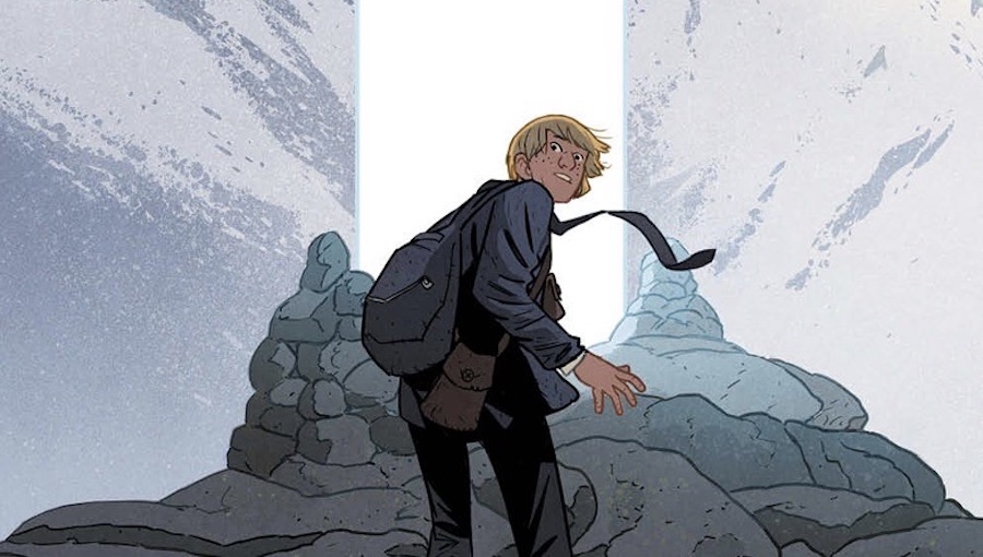
A confluence of characters occurs in the final issue of the first story arc of Matt Kindt and Matt Smith’s Folklords, and while some questions are answered, many more arise, giving way to a grander story and a greater good that needs to be accomplished. I’m excited!
Angel has lived his entire life in a fantasy/fairy tale world, but he dresses in clothing from and has visions of our world. His society, run by a cult-like city guard called The Librarians, sends those turning 18 on a quest each year – one of their choosing. Angel’s quest is to find the Folklords, but, before he can, the Librarians call a lock down – no quests! Angel, driven to know more and understand what these visions are, sneaks out of city with his friend, Archer.
On their journey, they have met many familiar characters that skew the fairy tales we know and love. While reading this fifth issue, I was reminded of Ray Bradbury – The Martian Chronicles, specifically and how stories he loved influenced stories he wrote. #StoriesMatter in that they can bring us levels of comfort we’re not expecting, sometimes when we need it most. The best of them can tap into things we’ve experienced or imagined. There is something both challenging and comforting within the pages of Folklords. Just like a good folktale, a greater theme or lesson can be gleaned; varying levels of social commentary are peeking their heads over the horizon, and, at the same time, our characters are going on an adventure that perhaps we’ve all imagined ourselves going on while reading stories we love.
The more comic books that I read, the more important the design work becomes to me – the bits and pieces before, after, and between the panels. There’s no doubt Matt Smith’s artwork and Chris O’Halloran’s colors are exceptional. In one sequence, the shifting of power, space, and worlds are punctuated with a whole new palette of colors and visual simplicity that speaks volumes: shifting from fantasy to reality in the form of a more modern visual approach. It’s thoughtful and meaningful storytelling.
However, like the opening title sequence of a TV show or a film, without a title page that works within the confines of everything else that’s being produced while adding an element that solidifies the vision, it feels like something is missing. That is not missing here. The gold logo over the turquoise background has the feel of something both old and new, like an ancient tapestry hanging in a modern museum. It’s hard to spot great design work sometimes, because, often, when it’s at its best, you won’t notice it… the same theory applies with lettering. Jim Campbell’s lettering is really fun. He manages to balance several styles without breaking the reality of what’s happening, instead only adding to it. The sound of a modern war machine made me chuckle, especially when its true nature was revealed.
With the end of this first volume, I’d say it’s just as good a time as any to pick up the series. You won’t have to wait month to month for the next chapter. Get the goods all in one sitting! It’s worth it!
Creative Team: Matt Kindt (writer), Matt Smith (illustrated by), Chris O’Halloran (colors), Jim Campbell (letters), Michelle Ankley (designer), Marie Krupina (logo design), Eric Harburn (editor)
Publisher: BOOM! Studios
Click here to purchase.

