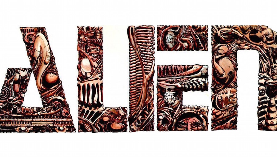
The 1979 story of Alien begins with a quote from Joseph Conrad. Not the mining ship Nostromo, named after one of Conrad’s novels, but the other direct quote, from his Heart of Darkness: “We live as we dream – alone.” Then, we see the unmistakable Alien title font: an H. R. Giger-inspired melange of indeterminate limbs, gnashing teeth, curvaceous techno-pipes, and shadowy apertures. This is followed by the omniscient narrator offering in fragments that “It starts with a ship… The ship… And the silence… Then… …The silence ends…” The USCSS Nostromo whirs into life through a series of repetitive clicks and concussive binary metres; the fateful crew wake up for the last time. Chattering, clattering, and complaining about full shares.
This uncanny introduction to the first entry of the sprawling xenomorph saga, which is both familiar and entirely different to the theatrical release of Alien (1979), is not another stab at an Alien: Director’s Cut (2003). It wholly belongs to Alien: The Illustrated Story, the comic book adaptation of the original movie.
Published the same year that Alien released but written while the film was still a two-and-a-half-hour rough cut and three different scripts (see CBR’s 2012 interview with Walt Simonson), The Illustrated Story was published by Heavy Metal Communications in 1979, first as a two-part teaser in Heavy Metal Magazine, and then as a standalone trade paperback to tie-in with the release of the movie.
Written by Archie Goodwin (original writer on Iron Man, co-creator of Luke Cage, and former editor-in-chief of Marvel who brought in the Star Wars comics license) and with art by Walt Simonson (acclaimed runs on Manhunter with Goodwin, and writing/drawing Thor, Fantastic Four, Battlestar Galactica), the combined talent prompted Frank Miller to provide the blurb for the 2012 Titan Books reprint, having been out of print for 33 years: “Alien: The Illustrated Story might just be the only successful movie adaptation ever done in comics.” This focus on quality for a Hollywood tie-in also helps to explain how the book was the first graphic novel to make the New York Times Mass Market bestseller list, staying there for eight weeks between July and September 1979. (See page 272 of American Comic Book Chronicles: The 1970s by Jason Sacks, Keith Dallas, and Davd Dykema.) Presumably, the sales had nothing to do with frustrated teens trying to get a glimpse of the film, rated “X” in the UK for its “perverse view of the reproductive function” (according to a 2012 Telegraph article).
To borrow from Ash, The Illustrated Story is “a perfect organism. And that structural perfection is matched only by its hostility,” The comic takes two hours of oppressive, cinematic space-horror and translates it into a lean 64-page cascade of frantic terror and violence. Although Simonson’s work on the comic replicates the props, ship models, backgrounds, and character likenesses with a high degree of accuracy and depth, The Illustrated Story doesn’t recreate the movie shot-for-shot like a photobook – chopped up, dismembered, and devoid of contextual and narrative resonance. Instead, The Illustrated Story successfully adapts, and with that freedom, it reframes the classic plot beats and familiar action for a different medium.
The movie is full of vast, dark corridors full of smoke, shadows, and expelled ship mists of an indeterminate nature, which the shipmates scurry around, often captured in wide-angled shots for dramatic effect. By comparison, the layout of the comic mostly follows a traditional grid structure, meaning that character agency is more tightly framed. Fog and steam are absent once the alien is onboard, with a noticeable increase in color contrast to pick out the various elements at play on each page. Not leaving as much room for the cinematic atmospherics, the comic relies more heavily on densely packed action, creating a different route towards the same claustrophobic feeling of isolation. Even as the panels of the narrative begin to unshackle their terrors, the viewer/reader still can’t see what’s happening on the de-fogged fringes of the frame until the alien is ready to splatter us and the crew of the Nostromo with unabated horror.
Let’s take Brett as an example.
In The Illustrated Story, when he realizes that the alien has shed its skin and maneuvered its way around him, the three steps towards Brett’s rude realization are structurally adapted for sequential use within the comic book narrative, happening across three increasingly shrinking panels. Taking up less than a quarter of the page in their entirety, the comic moves from showing the hapless engineer in full profile seeing the discarded remnants, to his partial torso holding up the thing, down to a tight close-up of his eye peering off-frame at whatever left the deflated skin sack.
From a taut point of visual and dramatic contraction, the page overleaf then explodes the action outwards, destroying the structural framework of the established and regimented presentation as the oversized alien enthusiastically takes up most of the page and leaps towards Brett in a three-quarter pose as though it were leaving the confining restrictions of the comic itself (in the same pop-up book way that Kane “birthed” it only a mere four pages previously).
This is then followed by a moment deleted from the movie, with the alien’s tail snaking between Brett’s legs as a thin header across the top of the next page (echoing Lambert’s death in the movie), before slowly pulling him closer in four successive panels” a page-wide extreme close-up on the salivating maw from the first person perspective; and a final, parallel “AAAARRG…”, rounded off with a blood-splatter punctuation mark across the page and surrounding panels. A miniature Ripley and Parker are situated beneath the curtailed scream in the corner of the page in a separate frame, recoiling in shock at the monstrous font of crimson that threatens to both literally and figuratively wash over them.

This sequence highlights how The Illustrated Story extrapolates from the source material and makes it something alien but still feels Alien, maybe as recounted by a terrified survivor who has less time for establishing theatrics and a greater focus on the indelible trauma of violence. Brett’s death is presented differently to that in the film, with its one quick flash of Brett getting his head staked by a serrated oral jack-hammer. The comic monster dominates the view and almost all of the page, being proportionally larger than it is in the film and less bound by the constraints of effects budgets and production schedules. Where the film offered a glimpse of the xenomorph, building up tension until later in the story, with each attack in the comic it is frozen before the gaze of the reader: familiar, yet presented differently for us to explore in further detail or shrink back from.

In this interpretation, the tension isn’t as front-loaded as it is in the movie with Brett mooching through shadows; here, we have a more immediate and dynamic confrontation. It’s the same with Kane’s chest-burster scene (We don’t see him wake up in the infirmary, for example.), Lambert’s fight with Ash (This scene takes nearly a full three pages.), and Ripley’s duel with the alien once she’s aboard the Narcissus. Without the luxury of expositional time that Alien has, they all pretty much just get straight into it. Not sweaty and creeping like in the original movie, Ripley of The Illustrated Story is already behaving more like her “Get away from her, you BITCH!” persona developed over subsequent Alien movies, sprinting into spacesuits and battle stations then defiantly bellowing, “Goodbye, you bastard!” as the harpooned stowaway floats out into space.
Among the genetically remixed elements, there are also the “extra scenes:” the moments that were taken from the pre-production stage of Alien and failed to make the final cut of the film but made it into The Illustrated Story. Building on the enmeshed Giger aesthetic, there’s a curious moment where the curled-up creature is seemingly mistaken for a storage container but is then revealed to be an alien frame, contorted in a biologically naturalistic way that perhaps a man-in-the-suit can’t (CBR’s Simonson interview). Less successfully, Ripley and Lambert have an awkward back and forth about Ash not being interested in sleeping with them, as though the space-nymphs can’t comprehend how their charms failed to penetrate his sterile façade without something being somehow wrong with him. Lambert also manages to develop some of the spine she was finally imbued with 24 years later in the Director’s Cut when she attacks Ripley for – justifiably – not opening the airlock upon their return from the derelict ship.
I initially came across The Illustrated Story when I read a 2013 interview with comic book artist Georges Jeanty (pencils on Buffy the Vampire Slayer: Season Eight). Jeanty had just been announced as the series artist for the Serenity comics, and part of his response to influences on his sci-fi world-building process included the line: “Artist Mobius is a big inspiration, along with Geof Darrow. Walt Simonson on Alien is a good thing to keep handy. Also, movies like Blade Runner, Outland, Alien — anything with a rustic, futuristic feel” ( see CBR’s interview with Georges Jeanty). Looking at The Illustrated Story, it is easy to see how the art design can still offer so much to the genre.
There’s a gigantic, double-page spread of the derelict ship, rendering the human visitors a fraction of an inch tall on the page. Note how the Alliance cruiser of Jeanty’s Serenity: Leaves on the Wind looks very much like the derelict alien ship with a Nostromo-esque quartet of pyramidal spikes atop of it. As the Nostromo crashes to the ground or blasts off, the pages contain as much kinetic energy as the alien will violently engender once the crew are back in space. The first image of the Nostromo is not only impressive, it also features a unique Giger-esque frame drawn around it, uniting the two techno-organic cultures with a touch that would be impossible in film. The same level of detail continues inside the ships with organic tubular piping coalescing within sharp industrial frameworks; the ships are thematically significant, but also look like they have practical purpose, like they’ve been lived in and used according to a functional inner logic, even when they are carrying hundreds of improbably stored space-eggs or flushing waste out of the airlock.

So, Conrad’s opening gambit of “We live as we dream – alone” doesn’t quite present the whole picture then. When we have a thoroughly entertaining collective nightmare through a book such as Alien: The Illustrated Story, we can’t be alone. This is a shared experience, amplified by a love of the original movie. Surely, there has to be someone or something waiting for us, just off frame…
Carl Wilson hails from Sheffield, UK. He has written on subjects ranging from Armenian Cinema through to the X-Men for the Directory of World Cinema, World Film Locations, and Fan Phenomena book series. He is currently a staff writer for PopMatters, where has also contributed to edited collections on Doctor Who and Joss Whedon.

