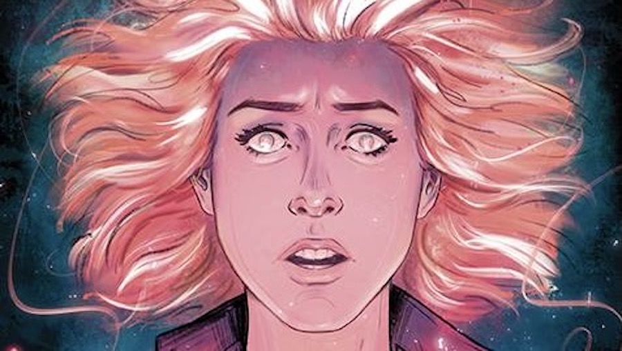
Well, gentle readers, the last time we were in Sunnydale 2.2(?), Drusilla and her goons had made it to the Transporium, and Willow, Xander, Giles, and Tara seemed in imminent danger. With two Slayers and a vampire kinda tied up at the Bronze, things seemed pretty grim.
Issue #15 brings us right to the aftermath of Dru’s visit to the magic shop, with Xander and Willow captured, and the remaining Scoobies trying to figure out Dru’s plan, which she apparently conveniently dropped illustrated diagrams of. Meanwhile, Spike seems a bit withhold-y with information here, seeing as Dru basically already told him her whole plan. While the double-page spread is a nice exposition summary, it also seems like a bit of a waste of page space for information we already knew.
Sarah Gailey’s script in this issue is a bit of a mixed bag for me. On the one hand, the one-liners and quips are great and really capture that old-school Buffy feel. I particularly love the references to Queen of the Damned (RIP, Aaliyah) and how short Buffy really is. The flipside for me, where I’ve had doubts about before, and as alluded to above, is that the pacing seems to occasionally be a bit off, in my opinion. While the first arc felt too long with too much filler, this second concluding arc feels more compact, but it also means that the stakes don’t really seem convincing despite the dire expositioning because there doesn’t seem to be enough buildup. It’s feeling very Season 1, if you know what I mean. (Which has its own particular charms, don’t get me wrong.)
Kath Lobo is joined by Roberta Ingranata on art duties, and the art styles are quite different, often with some inconsistencies, too. (Pay attention to Giles.) Ingranata’s linework seems to be less influenced by manga, whereas Lobo’s work clearly has some of those sensibilities. There is a fantastic sequence as Buffy, Faith, and Spike fight their way through a familiar lair. The colorwork by Valentina Pinto and Riccardo Giardina helps to keep the pages looking cohesive, with some really nice lighting effects, especially with Baby Crab. Sidebar: Why is Baby Crab red in the first place? He ain’t cooked… Ed Dukeshire’s lettering is lovely to read, as per yoosh. I really like how the overlapping speech bubbles give you a sense of how these characters are sorta talking over each other, which they often do, and it’s such an intuitive way of doing it that it wasn’t until I heard myself reading them with different timing in between lines that I realized it.
Overall, with approximately 2/3 of our heroes already in the fray, it’s only a matter of time before things are gonna get real punchy and kicky. Stay tuned for the final issue next month!
Creative Team: Sarah Gailey (writer), Kath Lobo, Roberta Ingranata (artists), Valentina Pinto, Riccardo Giardina (colorists), Ed Dukeshire (letterer)
Publisher: BOOM! Studios
Click here to purchase.

